
19.09.2019
September 18, 2019
– NASA's effort to develop and deploy a small space station in orbit around the moon now has its own logo.
The agency's Johnson Space Center in Houston revealed the Gateway program logo in an update to its employee online newsletter on Tuesday (Sept. 17). The Gateway, which is sometimes referred to as the Lunar Gateway, is a component of NASA's Artemis program, which is focused on returning American astronauts — including the first woman — to the moon by 2024 before pushing onwards to Mars.
"It is a bold look closely aligned with the Artemis brand. The logo symbolizes NASA's efforts to go forward to the moon and on to Mars," wrote Deepthi Cauligi, a communications strategist, for Johnson Space Center's Roundup Reads.
The Gateway is intended to serve as a way station between Earth, lunar orbit and the moon's surface. The human-tended spacecraft will be a docking port for Orion spacecraft arriving from and returning to Earth, as well as a rendezvous point for lunar modules descending and ascending from the moon.
Comprised of a power and propulsion module and a habitat (at its initial, most basic configuration), the Gateway is planned for a highly-elliptical, eccentric orbit about the moon to enable access to a wide span of areas on the surface below, including Artemis' target at the lunar south pole.
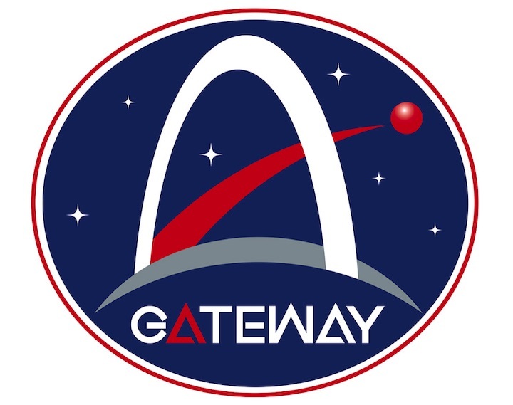
The new logo represents the Gateway's near rectilinear halo orbit above the grey horizon of the moon with a white arch similar in appearance to the iconic Gateway Arch in St. Louis, Missouri. From within the arch, a path extends out to a red orb.
"The red pathway inside the arch signifies Gateway's role in forging a path from the moon to Mars," described Cauligi, "with the moon as a testbed for Mars and providing an opportunity to demonstrate new technologies necessary for crewed Mars missions. The other end of the pathway shows Mars in red, remaining a horizon goal."
Six white stars dotting the logo's dark blue background symbolize the six Apollo missions that were the first to land humans on the moon between July 1969 and December 1972.
The oval-shaped emblem is completed with the word "Gateway" stylized in white, except for the first "A," which is highlighted in red, signifying the Gateway's role in the Artemis program.
"Through the Artemis program, a new class of American moonwalkers will inspire people all over the world," Cauligi wrote.
The Gateway logo was revealed in conjunction with a new internal website, which will house all information related to Gateway and Gateway components for NASA employees.
NASA previously solicited for a graphic to represent its Gateway program to "be used in multiple ways internally at NASA, but will have the limited external/public use, if any." The contest, run on the Freelancer website from Nov. 26 to Dec. 10, 2018, received more than 500 entries. A winning design was chosen, but it did not resemble the logo now in use.
Quelle: CS