
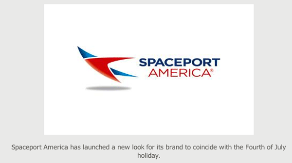
Spaceport America has launched a new look for its brand to coincide with the Fourth of July holiday.
The new identity has been dubbed “Spirit,” represented by two stars coming together. The symbolism is meant to reflect a collaboration of efforts to propel man’s reach into space, a news release said.
Spaceport America’s new brand colors are red and blue, with red symbolizing “energy, strength and power” and blue symbolizing “trust, loyalty and wisdom.”
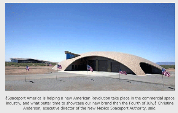
“Spaceport America is helping a new American Revolution take place in the commercial space industry, and what better time to showcase our new brand than the Fourth of July,” Christine Anderson, executive director of the New Mexico Spaceport Authority, said.
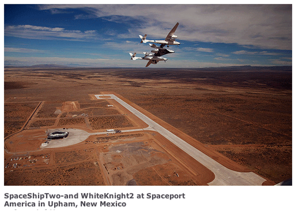
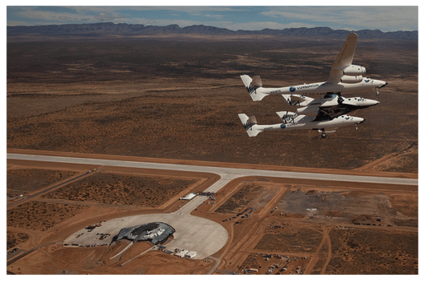
Fotos: Spaceport America
Mehr darüber hier: http://spaceportamerica.com/press-release/spaceport-america-celebrates-independence-day-with-a-brand-new-look-new-control-center/
7188 Views